Page 91 - CTI75_EN
P. 91
T


 the bottle shaped with a wide top and a thin bottom   Also, a lot of efforts have been made on the
 was selected along with the frosted material to make   shapes of bottles. Last year, HEYTEA launched its
 a translucent appearance and a slip-proof effect   fruit yogurt in bottle, marketed as a low calorie
 with rich texture. A groove was designed on the   healthy eating habit. Accordingly, PET bottles with
 rim of the cup to keep lipstick from sticking. Leak-  hard materials (still in the shape of dirty tea bottles)
 proof plugs on lids were designed to look like male   were specially selected along with a separate de-
 and female icons. The design had been adjusted 18   tachable compartment for fruits and grains to dis-
 times to get the ‘best grip’ before it was given the   tinguish them from other similar products on the
 ‘Nayuki tea cup’ title. Since then, the design of   market. In the milk tea culture where take-away and
 ‘Nayuki tea cup’ has been remodeled by various   take-out enjoy a great popularity, success depends
 manufacturers. Its specific parameters may have   on details. Even if it is just a small plastic holder, it
 become the standard of the industry. Other remod-  plays a big role not only in separating the yogurt
 eled designs include the chunky round milk tea   and fruit to maintain the best taste, also in keeping
 bottle of dirty tea, sealing and printing technology,   the ingredients intact when consumers or delivery
 the bottle covers, and so on.  men carry them. The neat and clean design looks
 The slender translucent milk tea bottles,   like a tail light of a bike penetrating the dark night,
 chunky  round dirty  tea  bottles  and  standard   grabs people’s attentions and excites curiosity.
 paper cups of hot drinks have become the most
 iconic designs in the rise of new tea. Therefore,   Creative Freedom of the Indie Brands
 the creation in this field has become a top prior-
 ity of the packaging design department for each   When the chain brands market the milk tea
 major brand. The design elements include graph-  bottles into brand images, and industry patents, the
 ic designs and reshaping the lids, etc. For exam-  indie boutique brands, not to be outdone, draw upon
 ple, Nayuki updated its logo by changing the   the creative freedom to carry out a revolution out-
 graphics on the bottles; HEYTEA invented a ro-  side the box.
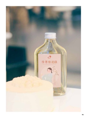
 tatable lid for its snow cap tea with chocolate   One of them is health-preserving tea from
 powder on the top, and LELECHA released the   ChunFeng, which was a huge hit in 2019 Shanghai.
 limited edition of milk tea bottles, which collab-  The renowned royal jelly water was bottled in a bell-
 orated with other brands and illustrators.  shaped transparent container, placed on ceramic tiles
 and illuminated with strong and bright lights. The
 light yellow tea looked crystal clear and mouthwater-
 ing. In sharp contrast with its Chinese tea competitor
 1828 Wang Laoji, it looked fancier and more expen-
 sive. Despite its ordinary taste, it stood out as a winner
 in terms of its brand image and the fact that it did
 successfully attract buying interests.
 The perfume bottle shaped milk tea which had
 been popular in South Korea has also landed in
 Shanghai. Triple P, founded by two Korean girls,
 opened its first shop on Changle Road in Shanghai.
 There are no seats in the shop for eat-in, but a
 display window of perfume bottle shaped milk tea
 illuminated by spotlights, which soon became a
 trending spot on social media. Decorated with fa-
 mous perfume icon ‘N°3’ stickers, thick glass and
 cork plugs, the mix and match was more inclined
 to be labeled as ‘fancy’.


 92                                                                                                   93
 92

