Page 25 - CTI78_EN
P. 25
C

                                                           not immediately get to know your coffee
                                                           products. However, Ben insists doing it be-
                                                           cause he wants to draw people’s attention
                                                           more to the hard work did by the women
                                                           behind all the high-quality coffee, instead of
                                                           merely telling the stories of the bean origins.
                                                           Ben explained: “We aim to illustrate a diver-
                                                           sity of women, different characters, different
                                                           styles, to show that Girls Who Grind Coffee
                                                           is for everyone. We wanted to add illustration
                                                           that made it stand-out, bold, graphic illustra-
                                                           tions that would catch the customer’s eye.”
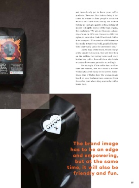
                                                                As the head of the brand, Fi is in charge
                                                           of the creative direction. She will brief Ben
                                                           on the coffee, the tasting notes and story
                                                           behind the coffee. Ben will then take briefs
                                                           to create the women portraits accordingly.
                                                                For example, if the coffee has a mellow
                                                           taste and feature, Ben will create a mellow
                                                           women character based on the coffee. Some-
                                                           times, they will also draw the woman image
                                                           based on a particular person, someone from
                                                           the coffee farm where they source the coffee
                                                           beans from.


 Therefore, for the Girls Who Grind Cof-  This strong yet welcoming brand image
 fee project, Ben does all his best to carry out   has been well expressed by the brand logo.
 Fi’s creative idea of the brand into powerful   According to Ben, the Girls Who Grind Cof-
 visuals. Ben worked on various projects and   fee logo is a little tattoo inspired. The custom-
 products long before Girls Who Grind Coffee,   ized cursive font with the arrows pointing at
 so it helps to make vision of his wife come true.   different directions gives the brand a cool and
 “Fi knew exactly what she wanted, and I know   urban attitude. At the same time, the logo also
 her better than anyone so it was really great to   takes some inspiration from the American   The brand image
 bring the brand to life together,” said Ben.  diner signage which makes it almost have a
  As a brand that means more than just   feeling of family.   has to be an edge
 coffee,  Fi  decides not to make Girls Who    However, the most eye-catching design
 Grind Coffee’s image to be like other sophis-  feature of Girls Who Grind Coffee is the clean   and empowering,
 ticated specialty coffee brands. She wants it   graphic women portraits on the product
 to be more urban, like a tattoo studio, street-  packages. It is unlike most coffee packagings   but at the same
 wear  or skate brand from her  home city of   where beautiful landscape of coffee origin
 Melbourne. The brand image has to be an edge   will be printed on. Surely it is a bit risky not   time, it will also be
 and empowering, but at the same time, it will   to put image that directly link to the coffee
 also be friendly and fun.  for the coffee packaging, as consumers will   friendly and fun.


 26                                                                                                   27

