Page 25 - #86 eng
P. 25
C


                                                           tailoring it based on the brand’s positioning and person-
                                                           ality, according to Yin. Once the primary color has been
                                                           decided, the designers have to repeat the comparison of
                                                           the rationality of the main color and auxiliary color col-
                                                           location  to  reach  harmony.  The  color  also  needs  to  be
                                                           tested  on  the  color  cards  and  the  actual  packaging  to
                                                           ensure they align in the real world. Finally, the colorful
                                                           packaging is ready to rock the consumers.
                                                               By  using  the  right  colors, specialty  coffee  brands
                                                           can set themselves apart from the rest of the market. The
                                                           colors can also be the messenger to deliver brand concepts
 Coffee Roasters which has been in the industry for 20
                                                           to  their  consumers  without  rolling  out  all  the  tirades.
 years,  Hasbean  has  one  of  the  largest  ranges  of  single
                                                           Also, for some specialty coffee brands with a range of
 origins. For the rebranding, in-house designers Ed Hughes
                                                           flavors, colors can be the labels for flavor notes. It would
 and  Fran  Newman-Day  want  the  new  packaging  to  be
                                                           make the specialty coffee more down-to-earth and easier
 more accessible to their consumers.
                                                           to approach by the new consumers. Even though coffee
 “Specialty  coffee  can  sometimes  be  a  confusing
                                                           is all about taste and smell, colors help communicate it
 place, especially for newcomers, and Hasbean has always
                                                           through visuals.
 been  about  making  great  specialty  coffee  accessible  to
                                                               As specialty coffee marketing expands, the visual
 everyone. As we have one of the largest ranges of single
                                                           presentation of coffee will inevitably become more im-
 origins, we wanted our customers to be able to quickly
                                                           portant in the future. Colors will keep on playing a piv-
 and  easily  break  down  the  range  into  different  flavor
                                                           otal role in coffee packaging. Yin thinks that we will see
 profiles. For us, color does this really effectively,” said
                                                           more diverse coffee packaging in the future. The use of
 Ed Hughes.
                                                           color and visual effects will be more experimental to draw
 Starting off by conversing with the roastery team to
                                                           younger  consumers’  attention.  So,  next  time  you  shop
 single out what the different profiles might be; the team
                                                           online for specialty coffee, be prepared for a more diverse
 has eventually broken it into Sweet, Cocoa, Spicy, Fruity,
                                                           colorful world of coffee presentations ahead.
 Floral,  Nutty,  and  Citrus  plus  Decaf.  From  there,  each
 profile has been assigned a different color by the design-
 ers,  according  to  the  best  representation  of  how  these
 coffees would taste. For example, yellow matches citrus,
 while gray represents nutty flavors. The designers also
 added ample space for an expanded flavor profile descrip-
 tion. This was written by the roastery team, and included
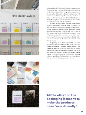
 information  such  as  “floral  notes”  and  “white  sugar   gives consumers a tangible link between the color and the
 sweetness”. The aim was to explain the flavor notes bet-  brand, like Starbucks. Other times, it can be a comple-
 ter and avoid any confusion. All the effort on the pack-  mentary color, which may convey a set of different fea-
 aging is meant to make the products more “user-friendly”.  tures about the brand, and form a united personality.
 Eventually, with the help of Pantone-inspired colors   For the Hasbean packaging, the designers’ aim was
 and flavor descriptors, consumers can instantly differen-  to find different colors for individual flavor profiles while
 tiate flavors by its visuals. Hughes told us: “We wanted   simultaneously keeping all the colors harmoniously for
 people to get a steer on a coffee’s flavor before they’ve   one theme. During the six-month creative process, one
 opened the bag. We were focused more on how the labels   of the biggest challenges for the Hasbean designers is to
 differentiate the coffees from one another. That was the   get all the colors to work together. The team has spent a
 main focus.”  long time doing many print tests to make sure each color
 However, finding the right color palette is not that   sat well next to the other and reproduced well digitally
 easy. Moreover, many practical factors have to be consid-  and physically. This is hard, especially when the team is   All the effort on the
 ered during the actual design process, such as the costs   meant to develop a large color palette. It takes a lot of
 and  materials.  For  most  coffee  packaging  design  that   practice and experiments.  packaging is meant to
 focuses on colors, the quest usually starts with seeking   Nevertheless, no matter what color strategies have
 the color that is in line with the brand positioning. This   been approached, the goal is to differentiate the brand in   make the products
 process requires the designers to have a deep understand-  the market. To be noticed, differentiation doesn’t mean   more “user-friendly”.
 ing of a brand. Sometimes, it can be one simple color that   finding a color that has not been used by other brands but


 24                                                                                                    25

