Page 23 - #86 eng
P. 23
C


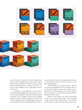
 The use of brighter and saturated colors

 can be seen more and more in

 specialty instant coffee packaging.


 Not  only  David  Choice,  the  use  of  brighter  and
 saturated colors can be seen more and more in specialty
 instant coffee packaging. For example, another famous
 Chinese instant specialty coffee brand, Yongpu, uses light
 yellow,  sometimes  even  pink,  and  baby  blue  for  their
 coffee  packaging.  While  TASOGARE,  another  uprising
 Chinese specialty instant coffee brand, has chosen satu-
 rated red and blue for its packaging. These colors are quite
 unconventional choices for coffee packaging, as for many
 people, probably, the “coffee palette” — dark brown, blue,
 green,  and  red  are  the  right  color  for  a  coffee  brand.
 Nevertheless, bright color is an identical element to dif-
 ferentiate  the  new  trend  of  specialty  coffee  from  the
 traditional commodity coffee brands.
 Of course, there’s a reason for those “ever-green”
 colors to appear on coffee packaging. Colors can some-
 times carry strong connections to specific industries and
 ideas. Coffee is one of them. Brown is probably the most
 used color for many traditional commodity coffee brands,
 and it is simply because coffee is brown. At the same time,
 green is also widely used for coffee packaging because
 green  is  associated  with  natural,  healthy,  and  organic.
 There is no denying that breaking the familiar color cod-
 ing of coffee packaging is risky. However, the switch of
 preference reflects the change in the market.
 The swap of the trend of color on the coffee pack-
 aging follows the change in the major coffee consumer
 group. Millennials are now the key target audience for
 many specialty coffee brands. Some 90% of the consum-  in  the  popularity  of  coffee  in  China,  the  competition   comes the emphasis on quality in the coffee market. Many   entiate coffee taste. However, for many brands, the reason
 ers of specialty instant coffee are aged between 18 to 35   among  coffee  brands  has  become  increasingly  serious,   coffee brands, especially those specialty coffee, aim to   for  using  different  colors  for  different  flavors  is  much
 years old, according to what Hengye Li from Secre Coffee   making different coffee brands scrambling to seek break-  bring out their own distinctive flavors. Usually, a special-  more straightforward.
 in  Guangzhou  said  in  an  interview  with  Perfect  Daily   throughs. They have to use all different ways other than   ty coffee brand would have a few different flavors. And   From Saturnbird, one of the pioneers in China to
 Grind. These young consumers are very likely to work in   just the products to blow up the consumer market and   colors are also commonly used to differentiate between   use colorful packaging for its instant specialty coffee, to
 the design, advertising, sales, and luxury sectors. Ener-  become a phenomenon,” Yin told us in the interview.  coffee flavors.   the innovative Nespresso, many coffee brands success-
 getic, bright colors are more appealing to them and more   According to a study published on ScienceDirect,   fully generated unique visual memory for their products
 visible on social media.   Colors as Flavor Notes  the colors of the packaging labels could influence senso-  and created super brand symbols by converting different
 “Personally, I think that rich and bright colors are   ry and hedonic judgments of specialty coffee by amateur   flavors into vibrant colors.
 not the essence of the trend. Instead, the main reason   Besides playing the role of the brand representative,   consumers.  These  consumers  would  have  pre-tasting   Hasbean Coffee Roasters, the 2022 Coffee Design
 behind this is the continuous iteration of younger coffee   color can do more for specialty coffee. The colors on the   ratings of sweetness and acidity based on the colors they   Awards  winner,  also  outplays  other  coffee  packaging
 users. They would accept all kinds of new and innovative   coffee packaging can also have practical functions for the   saw on the packages. This research finding would provide   designs by introducing its unique palette of 8 colors for
 visual presentations. At the same time, with the increase   coffee products. Accompanying the third wave of coffee   some functional benefits for packaging design to differ-  its rebranding. As part of the specialty roastery Ozone


 22                                                                                                    23

