
Page 105 - CTI84_EN
P. 105
T
precisely position and reduce marketing cost of a brand from the tea utensils, supplemented by lines. There is a we create works that express the spirit and knowledge of
on the one hand, on the other hand, it is because of pre- good combination of a set of 24 filial piety pictures with contemporary Chinese people.
cision that a brand can quickly stand out in an era of in- cursive on the cover. The illustration created by Professor “We will not define what exactly is the Chinese fad, we
formation explosion,” Bianhan said. Li Wang from Tianjin Academy of Fine Arts and the cur- prefer to see more different attributes and categories com-
sive from calligrapher Hongbiao Liu. In addition, Hell- bined with different forms to show more possibilities. We
Traditional² ocean also designed for the character inspired by the expect and call for more designers to pay attention to and
concept of inculcating oneself from the external norms to participate in the design of the Chinese fad. Tea culture itself
“There are categories without brands” is the most true present what Zeng Zihong wants to convey. is part of the traditional Chinese culture, excluding the
portrayal of the tea industry in China. After Lipton entered Faced with the homogenization in design of Chinese retro elements, I would like to see classic elements to bring
the Chinese market in 1992, it successfully cultivated the fad style, the work of Zeng Zihong presents us with the forth the new through the old and contribute to the shift
Chinese tea bag market, injecting new possibilities into the design attitude of “not confined to tradition, not lacking in from ‘Made in China’ to ‘created in China’,” Bianhan said.
traditional tea market and triggering more and more new innovation, and not lacking in ideas”. China has a cultural Just as an old saying goes, “Enjoy life sip by sip, not
tea brands. But later, Lipton was gradually replaced by local heritage of 5,000 years and thousands of treasures. Bianhan gulp by gulp.” Packaging design as an externalized aesthetic
tea bag brands. Gradually, the market has emerged one pointed out that while we use these valuable cultures, only tool, is for consumers and brand services, also need to be
after another, like instant tea, new-style tea drinks, etc. A by being more innovative and improving design skills can like tea drinking, stand firm, and even to lead the trend.
tea brand named Xurisheng created the first “ice tea” that
kicked off the development of tea drinks. The birth of new-
style tea drinks took China’s tea beverage market to a new
peak. According to iiMedia Research, a third-party data
China has a cultural heritage of
mining and analysis agency for the new economy industry,
5,000 years and thousands of
market size of China’s new-style tea drinks was 184.03
treasures. Bianhan pointed out
billion yuan in 2020. that while we use these valuable
These brands have better understanding of what young cultures, only by being more in-
Offline fresh-made tea people need, both in terms of products and design. The novative and improving design
skills can we create works that
Chinese fad emerged in 2018 and is still prevalent today.
The design of Anhe, a tea house, can be said to bring How does tea, itself part of the traditional Chinese culture, express the spirit and knowledge
of contemporary Chinese people.
the philosophy of “precision” into design perfectly. The small combine with the design of Chinese fad style to meet the
things that can be seen everywhere in life are miniaturized consumer’s sense of experience and sharing desire?
and simplified in the work, which is casual but charming. “The Chinese fad as a big cultural IP itself carries
This work was done by Bianhan himself in 2016. a strong character. How to highlight the unique tone of
In addition to tea houses, offline stores with new-style each brand on the basis of Chinese fad is what designers
tea drinks are also customers of Hellocean. 1° CTEA, cam- should think about as different brands share different
pus-oriented tea store, becoming popular among young con- positioning. So it is necessary for designers to under-
sumers with new packaging replaced in 2018. Green, off-white stand more about the characteristics, needs, preferenc-
and blue-green are the main colors, and the logo takes the es and so on between the brand and consumers, and find
form of two small hands clinking cups, conveying love and a point in it,” Bianhan said.
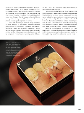
highlighting the youthful and fun tone. The main visual uses The packaging design of Zeng Zihong (a leaf tea
four campus characters and drink-related elements respec- selling brand) has indeed found such point. The brand
tively to build a familiar scene of drinking tea for consumers, name Zeng Zihong comes from Zeng Zi, who was highly
while conveying the brand’s philosophy, “nothing is added influential in reaffirming the Confucian emphasis on the
but love”. In the same year, Hellocean upgraded ARTSAG’s virtue of xiao (filial piety). Hellocean adopts Zeng Zi’s
design, a new-style tea drinks brand born in Singapore. Hel- virtue as the theme of the tea, hoping to inherit the filial
locean started with the brand’s English name AREASG, ex- piety and promote cultural tea brand with high-quality.
tracted the A as the main visual graphic, simplified and ab- The brand, logo, text and cover are very good at achieving
stracted the design to form a series of 5 icons, signifying the the effect of bringing forth the new through the old. The
different expressions when drinking different flavors, which logo in square shape on the packaging is based on the
distinctly differentiating from the ARTEA pirated versions brand theme, with the initial letter z of the word “Zeng”
that appeared in the market at that time. as the basis for the shape, conveying the spirit of heaven
It is Bianhan’s original design intention to sublimate and man are united as one and the harmony of nature.
the soul of the brand as he firmly believes that every brand Four square openings in the Logo means it can extend in
has its own unique soul. In the design of Hellocean, we all directions, and also shows the brand welcomes for
can also see the precise externalization of this belief talented artists to join, as well as the brand’s inclusiveness
through design. “‘Precision’ is especially important, it can and diversity. The concept of the text design originates
104 105