Page 24 - CTI80_EN
P. 24

C


                                                   Simplicity is a huge concept in Zen;
                                                   understandably, this carries over
                                                   into how architects design
                                                   environments and how Japanese
                                                   designers think about spatial
                                                   concepts.


                                                    Minimalist Saint Petersburg

                                                        Minimalist design is not only used in creating resi-
                                                    dential spaces for those who choose to live a simple life.
                                                    We have also seen it in practice in other areas such as
                                                    modern office design. It is less common, however, when
                                                    it comes to restaurants, coffee or dessert shops, places that
                                                    usually attempt to wow their customers with the power of
                                                    detail. This is why we talked to Andre Barinov, Russian
                                                    designer who recently designed one of the most minimal-            BUILT FOR
                                                    istic places in Saint Petersburg.
                                                        The interior design of this two-level coffee shop,             Your Success
                                                    located in the historical center of St. Petersburg, in a
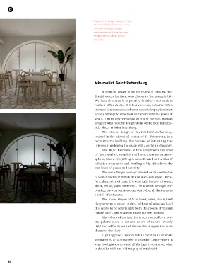
                                                    reconstructed building , has become an interesting task
                                                    in terms of endowing the space with a certain philosophy.
                                                        The major hallmarks of this design were top level
                                                    of functionality, simplicity of lines, creation an atmo-
                                                    sphere, where everything is subordinated to the idea of            Can your blender rough-chop
                                                    salvation from noise and bustling of big cities lives, the         ingredients in seconds?
                                                    ambience of peace and serenity.
                                                        The main design concept is based on the aesthetics             Vitamix® Commercial machines can.
                                                    of Scandinavian minimalism and wabi-sabi style. There-
                                                    fore, the choice of materials was made in favor of wood,           Reduce knife work (and prep time) by chopping
                                                    stone, metal, glass. Moreover, the accents is rough pro-           everything from mirepoix to parmesan cheese in
                                                    cessing, uneven surfaces, uneven color, all that creates           your Vitamix Commercial blender. With easy-to-use
                                                    a spirit of antiquity.                                             controls and the power to pulverize the toughest
                                                        The round shapes of furniture (tables, chairs) and             ingredients, we help you create menu magic.
                                                    the geometry of space (arches, half-round windows)—all
                                                    this seems to be referring to both the chosen styles and           Learn more at www.vitamix.com/Commercial.
                                                    nature itself, where are no sharp corners existed.
                                                        The colors of the interior is represented by a neu-
                                                    tral palette  close  to  repeats colors of  nature—mostly
                                                    light and coffee tones and shades that support the main
                                                    theme of the shop.
                                                        Lighting plays a special role in creating an intimate
                                                    atmosphere, an atmosphere of chamber space—there is
                                                    very few light sources and all the light is scattered, what
                                                    is also fits with the philosophy of wabi-sabi.


     26


                                                                                                             Ad_Issue 80_VP3_China.indd   1                                                                 11/4/20   3:28 PM
   19   20   21   22   23   24   25   26   27   28   29