Page 54 - #63 eng 电子版
P. 54
c    Desgin


                                Pictures by James Morgan


                                                                        customers to explore the space. A
                                             Main idea                  mezzanine level provides a view
                                                                        from above; symmetrical arches
                                               was to                   frame recessed seating and shelv-
                                                                        ing; and stairs and steps lead up-
                                             create an                  stairs, lead nowhere, and are inte-
                                                                        grated into shelving, fireplaces
                                           instagram-                   and the long marble bar.
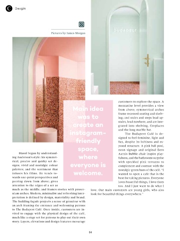
                                                                            The Budapest Café is de-
                                              friendly                  signed to feel feminine, light and
                                                                        fun, despite its loftiness  and  ex-
                                                space,                  posed structure. A pink ball pool,
                                                                        neon signage and original Eero
            Biasol began by understand-                                 Aarnio Bubble  chair  inspire play-
        ing Anderson’s style: his symmet-       where                   fulness, and the bathrooms surprise
        rical, precise and quirky set de-                               with speckled pink terrazzo to
        signs; vivid and nostalgic colour   everyone is                 complement and contrast with the
        palettes; and the sentiment that                                nostalgic-green hues of the café. “I
        infuses  his  films.  He  tends  to-  welcome.                  wanted to open a cafe that is the
        wards one-point perspectives and                                best for taking pictures. Everyone
        peering down from above; gives                                  loves beautiful things, I love them
        attention to the edges of a set as                              too. And I just want to do what I
        much as the middle; and frames stories with prosce-  love. Our main customers are young girls, who also
        nium arches. Modern, minimalist and refreshing inter-  look for beautiful things everywhere.”
        pretation is defined by design, materiality and brand.
        The building façade projects a sense of grandeur with
        an arch framing the entrance and welcoming patrons
        to The Budapest Café. Once inside, customers are in-
        vited to engage with the physical design of the café,
        much like a stage set for patrons to play out their own
        story. Layers, elevations and design features encourage


                                                      54

