
George & Willy, a brand name that talks for itself. Seeing it for the first time you probably think of two friends working together and you are absolutely right! Will McCallum and George Wilkins met in school, after what they went on and studied at university together. Both of them ended up doing commerce because at that age no one is really sure what they want to do. But at the same time, they took a couple of design papers on the side, that allowed them access to the university workshop with all sorts of tools and materials to play with, having come from a childhood of tinkering in the shed they were both fizzing to get in there and start making everything: indoor swings, lamps, toy helicopters, giant matchsticks. The commerce background also helped, as it’s very important to have a solid business behind your products.
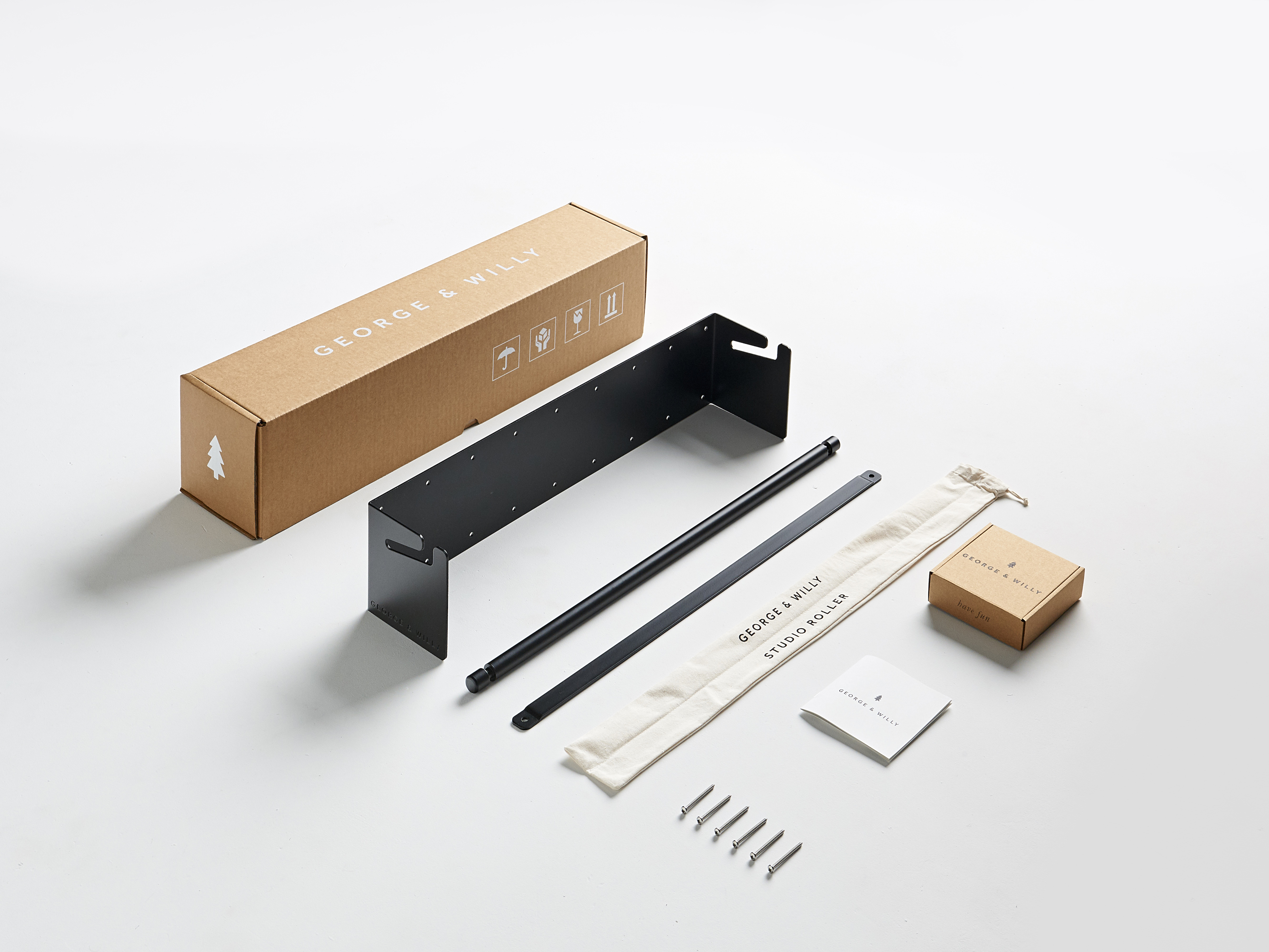
There was no particular moment when Willy and George decided to start a business. As they usually make what they need in everyday life but can’t find anywhere, they were just designing things for fun and other people liked it so they started making more and more. Being two young creatives might be hard, but luckily today with the help of the Internet and fast logistics, people from all around the world can check out, order and pre-order what the two create. In fact, even though designers are based in New Zealand, most of their works are sent overseas.
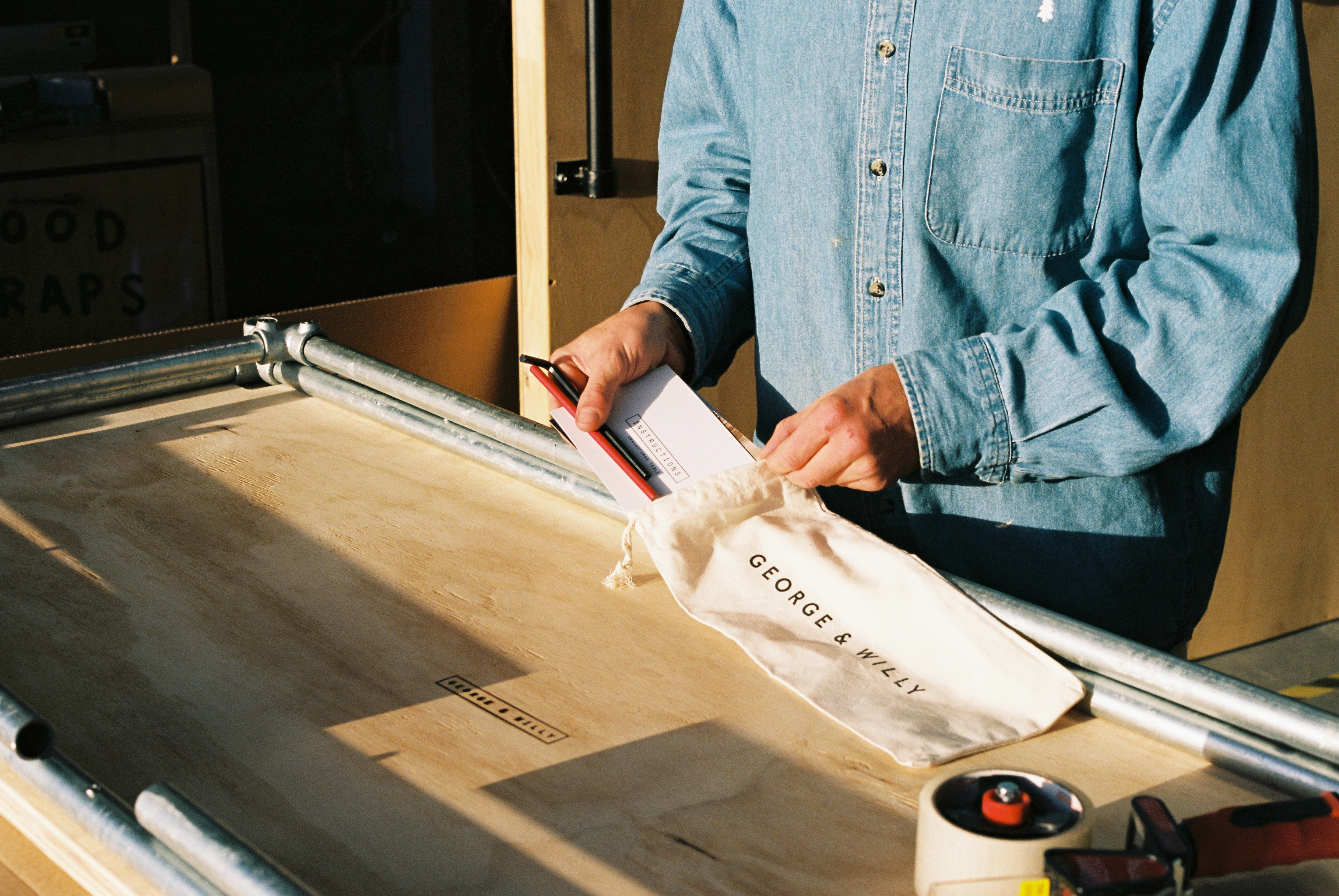
There is no surprise that things George and Willy create are so popular. They are very focused on materials and always look for the best: their rope is yachting braid, leather is from Italy, wood is from New Zealand and Russia. If you have good materials, the design speaks for itself and the product will last almost forever. “we are inspired by the things you find in your grandparents shed and things which have been around for 100 years; we want to make things like they used to. No plastic or MDF, just honest materials which will stand the test of time,” says Willy.

Being coffee lovers themselves, the two noticed that there is something that can be better in a modern coffee shop – the menu. When you go into a café, craft brewery or anywhere with a menu, it’s the first thing you look at to choose what to eat or drink. You have to look at it, after designers thought about this they have loved making display systems and menus: Studio Roller has been great but relies on someone with nice handwriting, the Baker Menu and Letter can go up on the wall, share words, look good and serve as an interactive piece on the wall for people to change and play with. As designers said, there just were not that many options out there for exciting menus that were quick, easy and look good. Well now there are! The menu systems are easily changed which is great if your coffees are on rotation or from different countries at different times. Recently the design duo also created new range of signs. And they are very excited about it as before you look at the menu, you look at the sign to the café.

Modern coffee shop is a sober pub, where all design should be user-friendly and social. So it is important to create things which are interactive, which people can play with. For the two designers, the goal is to make people feel good and be inspired in the spaces. When you go into a café, you need to be inspired. George and Willy hope their products inspire people and bring them away from the technology focused world we live in and back to what a menu could have been like 100 years ago.



NO COMMENT